Hadlock Paints: Rochester's #1 Paint Store

Thursday, November 30, 2017

A Quick Blog on Painting Bathrooms

I've come upon many questions on this topic lately. Some customers have been having problems with painting the bathroom, or they are unsure of what do use in this location. Because of the special conditions with moisture and humidity in bathroom, it can sometimes be confusing what paint to use. Is it OK to use the same paint that you would in a bedroom or living room? Or do you have to use a special paint? Is there an additive you can add to paints for help with the issues? These are just a few of the questions that may come up when tackling a bathroom job.

There are a few special paints for bathrooms that work really well. We have a Kitchen and Bath Satin finish paint that holds up well to high moisture conditions. It does have a decent sheen, but not quite as much as a semi-gloss. If you want something with slightly less sheen then our Pearl finish is also a good choice. We don't usually recommend an Eggshell finish but it isn't out of the question. It may work well if you have a separate bath area away from the shower, but keep in mind that the eggshell is washable, but not as scrubbable  as a pearl, satin or semi-gloss finish. If you do you an eggshell, it's always best to have a really good ventilation fan in your bath. For those of you who prefer a very low flat sheen, Benjamin Moore came our with a Bath and Spa Matte finish a few years ago, which is scrubbable, moisture resistant, and also fights off those drip marks that can sometimes happen to low sheen paints in high moisture areas. 

For ceilings, the Bath and Spa Matte is a great choice, however it may be a little pricey for a ceiling paint. You could use the same paint as the walls, but most people do not like to have those higher sheens on ceilings. It's not recommended using a regular ceiling paint however, so don't make that mistake. They just aren't formulated to deal with the high humidity and you may have cracking, peeling, or mildew issues if you use one. We have a paint by Zinsser called Perma-White, that is a mold and mildew resistant paint perfect for bathroom areas. It also comes in an eggshell finish, which may be a good choice for your bathroom ceiling. 

When it comes to paint additives, we do offer a mildewcide additive, but most bathroom paints have one built in, and the additive is usually only necessary for problem bathrooms that experience an unusually high amount of mold and mildew or have a poor circulating fan. 

With the holidays approaching, smaller jobs such as bathrooms are very popular to attack. It is one of the highest traffic areas in the home, especially if you have lots of guests coming over. So just remember that correct product selection is very important in the bathroom and if you do it right, you can save yourself a lot of time and eliminate problems that could occur in the future. We are more than happy to answer any questions you might have about painting your bathroom. It's a great place to start if you're a novice because there usually isn't much wall space. But its more than important to use the right products here... happy painting!!

Todd

Saturday, April 22, 2017

Benjamin Moore 2017 Color Trends Review

Benjamin Moore announced their new color palette in October and it was a big change from what we had seen in previous years. So now that we have had a few months to experience and interact with Benjamin Moore's 2017 Color Trends, it's time for a little discussion on what I feel is good and bad about this year's interesting palette.

First I applaud Ben Moore for trying something new with the trends this year. Picking 2117-30 Shadow and deep and dark purple as their color of the year was.. well it was trendy since many other paint companies also picked a purple or violet hue, but Benjamin Moore's choice was by far the deepest and most dramatic of the bunch. The company's creative director Ellen O'Neill had this to say about Shadow: "It is a master of ambiance. It ebbs and flows with its surroundings and light brings it to life. Rich, royal amethyst can fade into the soft lilac-gray of distant mountains or morph into lustrous coal. Indulge your mysterious side. Let Shadow set the mood." 2016 was filled with a ton of off-whites since they were going for a clean and crisp "restart" theme and while those colors are much easier to use they were quite boring. This year's collection is filled with deep and rich colors, trying to move the consumer out of their comfort zone and try something bold.

So as much as I am happy to see some color it is a little confusing to see so much purple in the palette. I understand the reasoning behind it. Purple is really the one color that has never really had it's time in the sun. But there seems to be a reason behind that. There are two colors that I feel are hardest to use in an efficient way. Purple and Orange. Think about the other colors of the rainbow and how common they are to see in paints. Red front doors and accent walls. Creams and golds that work well in many situations to represent the yellow spectrum. Green, the color of nature and really the most versatile color. It can be anywhere on the spectrum from sage to teal and there are so many different tones of green. Blue is the most popular color in the world and can be used both as a slate gray blue or popular deep navy. But orange and purple really don't have a niche. Orange evokes thoughts of construction and Halloween. And purple, while the color of royalty, is also representative of magic, mysteriousness and uncertainty. As a light shade it also feels very juvenile. So to see no less than seven shades of purple in this years color trends palette is a little overpurpling.

Another negative that I see in the trends is that lack of a neutral or gray base. There is AF-680 Wish and 2112-50 Stormy Monday and that's about as close as you get to a neutral and gray. But even these color can sometimes cast a purple undertone. Throwing one or two neutrals into the palette would have helped immensely and they could have been used to balance out the overload of deep tones that were chosen instead. It's much easier to get a customer to pick a neutral and then accent different places in their home with the bold jewel tones that we see this year in the color trends.

Overall I do like the 2017 Trends better than the previous year. 2122-50 Iceberg and 2062-20 Gentleman's Gray are two of my favorites. It is nice to see a transition to color in the world of off white and gray that has been going on for far too long. Hopefully some of the bolder colors catch on. And now a reference to the movie "Mean Girls" where one character creates a catchphrase "fetch" and another character tells her to "quit trying to make fetch happen!" That is how I feel about purple. Quit trying to make purple happen.
The 2017 Color Trends Palette

Shadow

Gentleman's Gray

Wish

Stormy Monday
Iceberg

Tuesday, October 25, 2016

2016 Exterior Season Wrap Up

I'm pretty sure I heard freezing rain on my window last night, which of course means one thing.. that dreaded "s word" is right around the corner. The temperatures are steadily dropping and the leaves have changed and are dropping as well, which means it's time to say goodbye to yet another successful exterior painting season. This summer saw a lot of record temperatures and dryness which at some point made painting outside uncomfortable, but for the most part allowed a lot of work to get done. So let's look back on some of the trends, successes and failures that we saw this season.

Gray Continues to Dominate
It's not popular for interior color selection. Gray was a stand out color for exteriors this year as well. Dark grays do look great on the exterior of many houses and we pushed a lot of gray paint out our doors over the past few months. Some of the colors that were our most popular included the historical colors Kendall Charcoal, Amherst Gray and Chelsea Gray. The historical collection has always been a popular choice, especially for exterior and these three were some of our favorites and customer's favorites as well.
Cooler gray seem to work better as exterior colors than interior so there were definitely more sales in these shades of gray as well. Another popular exterior color choice in this vein was dark gray, almost so dark that it was really more of a "light black" if that oxymoronic description even makes any sense. Graphite, Temptation, Wrought Iron, Midsummer Night, and Mopboard Black were all stand outs for a super dark house color. And they are very noticeable. We often had customers come into the store and ask what color were on these almost black homes. So if you're looking for a color that gets a lot of attention, don't be afraid to go to these deep black shades. They are sure to get people talking.
While gray was certainly popular, we did many colors for outside. Within two days, we had two separate homes painted in a deep purple. Blue grays continued to rise in popularity as well. Traditional black and white never gets old either. We hope to help you choose the perfect house color next year.

Bold Front Door Colors
For decades it seems, the red or burgundy door has been the standard and while it will always be a classic, this year we definitely saw a break from the mould, with people choosing brighter and bolder colors for their front doors! We always like to see some risk taking and I think these pops of color on your exterior are a great pay off and an easy and cost effective way to make a great change. You can usually paint your front door with a quart of paint, which on average costs about $25. It's one of the least expensive upgrades you can make and packs such a great punch as well.
Some of the color trends for front doors we noticed this year were an increase in bright blues, greens and teals. I had a customer use Bella Blue and it really looked amazing on the front of her home. If you are leery of treading too far from the traditional red, then you're in luck because bolder reds going toward orange or purple were also a big trend. One of my favorite front door colors that is definitely picking up speed is the Yellow or Gold door. This color choice also looks great if you've painted your exterior in a gray. Some of my favorites that I saw this year include Gold Leaf, Pan for Gold, Showtime, and Concord Ivory. If you want to start small in 2017, let us help you pick a front door color!


Solid Stain Popularity on the Rise
Benjamin Moore Arborcoat Solid Stain is a fantastic product if you have a wood sided home and want to keep that rustic or classic look, but want to have greater color choices than your traditional stains. It can be tinted to practically any Benjamin Moore color, expanding to possibilites for your exterior. We sold a record amount of this product this year, and also began carrying it in five gallon pails for your larger jobs, which made these jobs easier and more efficient. Stain can be so versatile and works not only for home exteriors, but decks, fences, sheds, outdoor furniture and any other wood surface. Along with the solid stain, Benjamin Moore's Arborcoat features a full line of exterior stains in different opacity levels and also in either alkyd or water based formulations. There is really a product for anything!

A Final Note of Exterior Season
We use the term "exterior season" for a reason. These products work best with the right weather and temperature conditions. In cold temperatures and wet weather conditions, our exterior products cannot achieve their high level of performance so if you are considering continuing using the products, try and do it in a heated garage or area that stays above the recommended temperature for application. We want you to get the most out of the great products we supply and using them improperly can result in poor adhesion, bubbling, peeling and other adverse effects. Feel free to ask questions about the products to any of our employees for suggestions, and remember. the 2017 Exterior Season will be here before you know it! We hope that our products and advice have created an amazing result in your home exteriors. We always welcome you to share pictures of your completed projects on our Facebook page as well. Hadlocks Facebook!  Maybe your work can inspire other customers!

Friday, May 20, 2016

Blasts From the Past: Are these decor and design trends HOT or NOT?

In the paint and decorating world, trends come and go.. and then sometimes come back again. Occasionally, these trends are more than worthy of a reintroduction and other times, we just wish that they would have stayed away. Of course, as with color and pretty much anything we deal with in this industry, it's all a matter of opinion to what works and what doesn't. Every designer and color expert has their own aesthetic and there really are no wrong design choices (well yes, there are. Sometimes things are just plain ugly!). So let's take a look at some design trends that we're seeing make a comeback and discuss if they're worth your time and if these trends are HOT or NOT.

DESIGN TREND: WALLPAPER
Trend Timeline: Wallpaper dates back to around the early 1500s, when large prints and murals were pasted to walls for decoration. They usually depicted scenery and landscapes. The main historical techniques are hand-painting, woodblock printing (overall the most common), stenciling, and various types of machine-printing. The first three all date back to before 1700. In 1748 the British Ambassador to Paris decorated his salon with blue flock wallpaper, which then became very fashionable there. The development of steam-powered printing presses in Britain in 1813 allowed manufacturers to mass-produce wallpaper, reducing its price and so making it affordable to working-class people. Wallpaper enjoyed a huge boom in popularity in the nineteenth century, seen as a cheap and very effective way of brightening up cramped and dark rooms in working-class areas. By the early twentieth century, wallpaper had established itself as one of the most popular household items across the Western world. Wallpaper has gone in and out of fashion since about 1930, but the overall trend has been for wallpaper-type patterned wallcoverings to lose ground to plain painted walls.

For years we've heard that "wallpaper is making a comeback!" and that may be somewhat true, but it is still nowhere near as big of a market as it once was. Current wallpaper manufacturers have done a good job and modernizing patterns to fit today's market. Thibault is a very popular high end wallpaper line that designers have loved for years. Our Brewster Wallcoverings have introduced many new contemporary books within the past few years that go away from the dated florals of your grandmother's bathroom. Metallic and geometric wallpapers and quite popular and we are also seeing a huge influx in grasscloth wallcoverings. 

VERDICT: We'll give wallpaper a WARM rating for now. If you can find a pattern that works for your space, definitely give wallpaper a try. There are some really interesting and even crazy patterns that at first may seem absurd, but can add an extra element to your living area that paint cannot. Grasscloth is a great option and continually growing in popularity, but keep in mind that it is much more delicate than a vinyl wallcovering so it may not be suitable for high traffic areas, or homes with children and animals. 

DESIGN TREND: ACCENT WALLS
Trend Timeline: When accent walls started trending a few years ago, it seemed like a passing fad. But the trend has proven it has staying power, and not everyone is happy about it. While some say they'll never stray from four matching walls, others stand firmly by accent walls' eye-catching style. But when you think about it, why should a wall be a focal point. Wouldn't it be better to have an architectural feature or a nice piece of art of furniture be your focal point?

VERDICT: Accent walls are NOT the best design trend anymore. Honestly, it's time to stop being afraid of color. Don't limit your color choice to a single wall, add it to the entire space. If anything create an accent wall with something interesting like wallpaper, exposed brick and stone, or another design idea. Using the wrong color can ruin the space. Designer Mariella Cruzado says "I'm absolutely against those random red accent walls that try to incorporate a pop of color in a room. Your home's color palette and decor should be cohesive and planned ahead," which makes perfect sense. Keep things simple and functional and don't do an accent wall just for the sake of doing it. 

DESIGN TREND: FAUX FINISHING
Trend Timeline: Faux finising is probably the oldest form of wall decor. Think about it.. prehistoric cave drawings and the famous Venetian plaster and stucco techniques that date from around 5,000 years ago in Mesopotamia and continued into the Roman and then Italian Renaissance time periods. Faux finishing as we know it however began with the Art Deco movement of the 1920s. In the late 1980s and early 1990s, faux finishing saw another major revival, as wallpaper began to fall out of fashion. At this point, faux painting became extremely popular in home environments, with high-end homes leading the trend. Color washing, ragging, sponging, strie, marbleizing, fresco and Venetian plaster were all the rage. And then the trend ended abruptly with the new millennium and all of those dated faux finishes became a pain in the neck to try and remove and cover up with simpler design choices. 

Today we are seeing a slight resurgence in specific types of faux finishing, specifically metallic finishes, which embody the modern and industrial trends that have flourished recently. We now carry the Modern Masters faux and metallic finishes line which have some amazing products! But what do we never want to see come back? Sponging.. just consistently feels like a dated 1980s look that had its time and should never be brought back

VERDICT: Metallic and specialty faux finishes- HOT. Dated and old fashioned faux finishes- DEFINITELY NOT!

DESIGN TREND: COLORED CEILINGS
Trend Timeline: In the history of paint and design, colored ceilings are a relatively new construct. The only really documented historical use of colored ceilings was the use of a light blue known as "Haint Blue" predominately in the South on their porches. It became popular in the 1800s and still continues to this day. We have a few recommendations when it comes to painting ceilings. If you're using a dark color in the room and want a dark dramatic ceiling, that's ok as long as the room can handle the added color. Another popular choice for ceiling color is to take the wall color and cut it in half for the ceiling, since colors tend to appear slightly darker when above. 

VERDICT: HOT!! Ceilings have been white for far too long and it's a great way to add more color to your space. Just make sure that the room can handle the color and it makes sense to use color on the ceiling. And always remember that 50% of the wall color is usually a good bet for your ceiling, unless your looking for a little extra. Maybe you could even bring in some of the faux finishing idea and do a metallic ceiling, which seem to be all the rage at the moment. A black or dark colored ceiling is great for a commercial space as well.

DESIGN TREND: MONOCHROMATIC COLOR SCHEMES

VERDICT: NOT. Having similar colors throughout the house may work if you're trying to sell, especially if everything is neutral, but every room is different and needs a different feel. It is okay to use a few similar colors of varying depths to transition from one room to another, but try adding a pop of color here and there. Guest rooms, powder rooms, ceilings, and dining rooms are perfect areas to spice it up and little and try something different.

DESIGN TREND: THE COLOR GRAY

VERDICT: Gray is a perfectly fine color as I discussed in an earlier blog and there are tons of nice grays that can work in your space. But eventually like everything else, the gray trend will end and you will be left with a cold and drab space. So I'll give gray a WARM rating (that seems like an oxymoron, but yes there are warm grays haha) but just remember to add a little color here and there, even if its just a throw pillow! Gray exteriors however, are HOT at the moment!


Just remember that trends come and go and the only opinion that matters is yours really since you have to live in the space. There are so many design options out there and so many interesting things you can do to your home! If you want to sponge finish a wall, you can! Who knows... maybe 20 years from now it will be all the rage again. And maybe by then we'll have figured out how to just press a button to instantly change paint color.. one can dream can't they? 

Thursday, April 21, 2016

My Thoughts on Ben Moore's 2016 Color Trends

Each year, Benjamin Moore designs a palette of colors that they believe will lead the way in design and decor. Within this group of colors, they designate one of them as their "Color of the Year." Past colors that have been awarded this title include Lemon Sorbet, Breath of Fresh Air and most recently in 2015, Guilford Green. Their marketing and research definitely does seem to work as I have seen each of those colors grow in popularity after it was named with the honor. Through the first four months of 2016, the trend has continued and I have seen an increase in selection of a color that was already hugely popular.

This year's color is OC-117 Simply White, a surprising choice for me at first, but after attending a color design seminar and doing more reading it definitely has its merits. Benjamin Moore's creative director Ellen O'Neill says that "white is transcendent, timeless, its versatility is unrivaled" and that it can be found "everywhere in every form." The main purpose for its selection was to create a clean and quiet palette that is highlighted with bold accents. Every color has its good and bad points so I will expand on my feelings on each of the color selections for this year and maybe even suggest some alternatives that.. who knows.. maybe will appear in 2017!

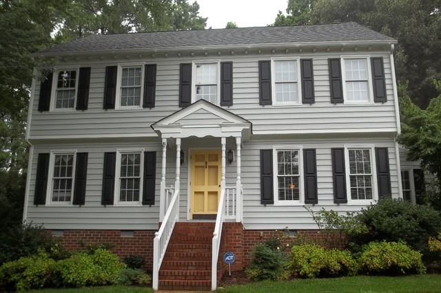
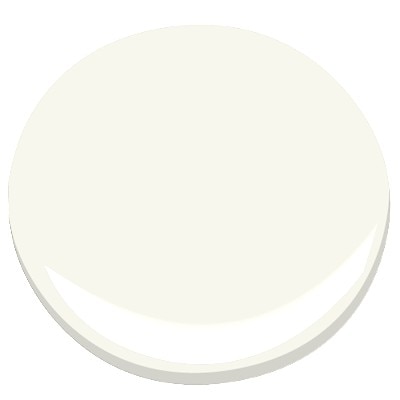
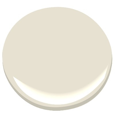
OC-117 Simply White: Do not adjust your screens, there is a color blob to the left. We have always described Simply White as one of our cleanest whites and that why it has been hugely popular as a trim and ceiling color. I have a hard time choosing it for customers as a wall color because it lacks.. well color.. but it will help to achieve that clean, crisp look without being too cold or stark like many whites that we have. It has a touch of golden yellow to it that warms it up just enough. Our Pinterest board has some great example of Simply White in action. I do like how it makes a kitchen look really clean and fresh, but just remember that you'll have to was the walls often because you can see everything on white!


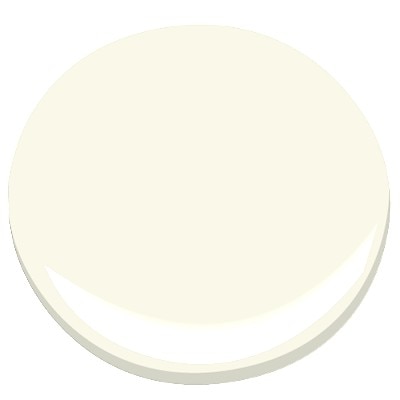
AF-20 Mascarpone: A slightly warmer and more creamy version of Simply White, this color has also been hugely popular before its inclusion to this year's color trends. I like its warmth and have been suggesting it for years, but it's funny now that the trends have shifted to super clean I'm almost afraid at times that it has too much yellow. It's a great second option though for customers who want just a little more than Simply White has to offer but who are still scared of color. There are a lot of customers like that!


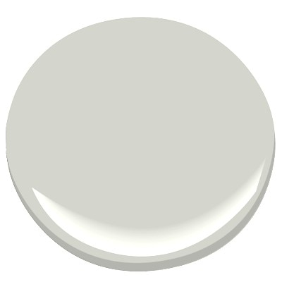
OC-52: Gray Owl: Before the Color Trends of 2016 were announced, this was actually my guess for what the Color of the Year was going to be. It is a slightly lighter and grayer version of the ever-popular Revere Pewter so I figured Benjamin Moore would go with something like this to fall into the gray trend that I discussed last week. It's an interesting color that I like to describe as a chameleon because it can take on so many appearances. Sometimes it's gray, sometimes cool brown. I have had customers use it and see blue, red, green, or even purple undertones in their homes. This can sometimes make it a difficult choice when the customer desires consistency in their home's appearance.


OC-9 Ballet White: This is actually the only color in this year's trends that I would group into the "neutral" or "beige" family which is a nice, but marked departure from a decade ago when everything was neutral and earthy. It does have a slight gray undertone, but still warm enough to work with other colors. I would describe it as the color of froth on cappuccino if I had to pick something. It's pretty nondescript and I suppose could work in many applications, but I would have liked to see something a little more interesting if it has to bee the only neutral in the palette, perhaps adding one of the newer Color Stories colors like Cake Batter or Lace Handkerchief.


2008-10 Ravishing Red, 2022-40 Banana Yellow, HC-119 Kittery Point Green, 2064-20 Patriot Blue, 2071-20 Gentle Violet: I don't expect many customers to use these colors to paint their entire house (the green is a slight exception) but the purpose of their addition to the 2016 Color Trends was for a pop of color and also to bring the full spectrum of the rainbow to balance out the starkness and neutrality of the included whites. These colors can work great as an accent wall or even better use them in fabrics, pillows, rugs and decor for a bold look on a smaller scale


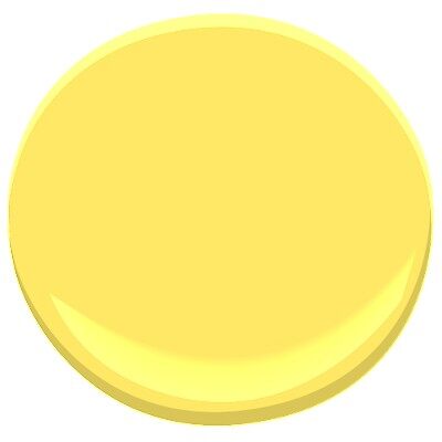
2174-70 Cream Puff, 2024-60 Lemonade, 2053-70 Morning Sky Blue, AF-505 Blue Echo, 2070-50 Enchanted: These colors are the secondary level of the primary colors. They still add some bright pops of color but have a lighter and airier feel to them. With the exception of Blue Echo, these colors are all on a pastel level and I'm not the biggest fan of these tones, I would actually prefer the bolder colors to these. I usually refer to them as "Easter Egg" colors. They're nice for kid's rooms and can possibly work in other situations but I rarely choose them.


OC-55 Paper White, AF-580 Luxe, 2127-20 Black Ink, AF-155 Weimaraner, AF-170 French Press: These are the blacks and browns of this year's trend colors and they add yet another layer to juxtapose with the clean whites and pure colors. Both of the browns have been popular and also work well as an exterior color. I used the Paper White for my parent's home because they wanted a very light gray but was slightly underwhelmed since it was so light. I think the next deeper color Sterling would have been a smarter choice for this palette.

Also included in the palette are 2076-20 Royal Flush, 2068-70 White Heaven and 2067-70 White Satin. Probably won't be doing too much mixing of those but who knows, maybe there is a perfect use for them somewhere.

So maybe there's a color here for you. Or maybe not. Color trends usually trickle down from the fashion and design industry a year later, so what you see on the runways and in magazines now will probably serve as a good forecast for what to expect from Benjamin Moore in 2017. This year's colors are based on "striking contrasts, bold lines and definitions," the contrast between white and color, between simple and complex, between starkness and saturation. My prediction for 2017's Color of the Year is a Color Stories color maybe? Possibly Subway Tile or Gotham to evoke that urban sophistication that everyone is after. Or maybe we'll see a nod to the deep grays with something classic like Kendall Charcoal or Graystone. We'll find out in a few months.. until then lets make the most of 2016 and really do something special with your space!


Thursday, April 7, 2016

Why Gray is Here to Stay

For the past two or so years, it seems like all all we've been mixing is gray paint! Now don't get me wrong, I actually like the color (or technically, the non-color) gray. It's one of my favorites along with blue. My entire wardrobe is gray. It goes with everything. And there are some great gray paint colors we have here at the store. Chelsea Gray and Kendall Charcoal are hugely popular for exteriors and they look great on a house. Cape May Cobblestone.. it's that perfect warm gray that everyone is after! Anyway, back to the point. All we mix is gray lately. Benjamin Moore offers at least 500 unique colors which I would consider to fall into the gray family, so really there's a gray available that can work anywhere. But what has made it so popular over the past few years? And why does that trend seem to be here to stay for a long time to come?

Trends are a big factor. It's 2016 and modern and contemporary is all the rage. And with these styles comes that cold industrial feel. Black appliances and stainless steel appliances have become the favorites, replaces the standard whites and almonds and bisques that dominated the market for so long. Exposed beams and pipes are popular so why not pick a gray to go with those metal tones right? Warm wood tones are not as popular as they were in the past and we are seeing a huge influx in people choosing darker or gray toned wood floors. Onyx and grayed whitewashed floors are increasing in popularity and therefore gray wall colors will follow suit. Modernity is cold and clean. It is efficient and emotionless. And what represents modern, cold and clean better than gray.

Another huge reason for us mixing gray nonstop?? ONE SINGLE COLOR. It is a color that has been around awhile. Years, decades it's been around. Just sitting in the Benjamin Moore fandeck patiently waiting for its fifteen minutes of fame. Waiting for its moment in the spotlight to become America's new addiction. A few years ago I'm guessing, someone randomly picked this color on a whim and painted their home with it.  And this person must have really enjoyed the look of their color and said "hey I'm going to post a picture of my new room color to Pinterest (or Facebook, or Instagram, or some social media outlet)," and from there it's all history. A friend shared it. And their friends shared it. And everyone shared it! And it exploded.. it's everywhere now, like an invasive weed that you can't get out of your garden. People come to the store in droves asking for it, sometimes one after another. There have been days we've mixed the color for five or six different customers. Customers stand at the counter talking to each other about how amazing this color is! What is this color? I'm sure by now many of you may have guessed. Maybe you've seen it plastered all over Pinterest. Maybe you even have it in your home (you're not alone!). It's Benjamin Moore's HC-172 Revere Pewter. This color that is somewhere in between gray and beige, yes it's really the definition of "greige" pretty much singlehandedly started that gray revolution, at least from what I've seen here at the store. It's a nice color, it really is. And it goes with many other colors. But I just have this idea in my head that every house you go into in Rochester (and who know, maybe the WORLD!) is Revere Pewter. When I can, I try to introduce other colors to people. After all we have around 4,500 color available just in Benjamin Moore.

I'm not against gray paint. I LOVE a lot of our gray colors and and more than happy to recommend them to a customer or client when they're the best option. But just remember that there are a lot of gray days in the year here in Upstate New York and having a gray home can get a little dreary. Another great quality of gray however is that you can accent it with pops of color. A bright pink or yellow pillow or throw. A cobalt blue vase. Deep burgundy rugs. Feel free to play around with color! Don't be afraid of it! Take a look below at a few of my favorite grays, including grays that have undertones of color to add just a touch of variation to your home.

Favorite Grays: AF-685 Thunder- a slightly deeper and grayer version of Revere Pewter. 2122-40 Smoke- that perfect gray blue. 2137-50 Sea Haze- can be gray, can be green, can be brown. 1473 Gray Husky- my favorite gray, just warm enough but still simple and gray. 1570 Gray Wisp- technically more of a green but with soft gray undertones. 1593 Adagio- for that cool steel gray. 859 Collingwood- a light warm gray, almost an off-white.

Benjamin Moore Revere Pewter